The Spending Party
- Gary Waldman
- Mar 24, 2019
- 6 min read

THE “SPENDING” PARTY
Introduction
I heard Senator Ted Cruz, erstwhile contender for the Republican presidential nomination, refer to the Democratic Party as the party of spending. More generally, Republicans try to pin the label “tax and spend” on their opposition Democrats. I wondered if that assertion was really true, so I decided to check history.
Before I proceed to look at the actual quantitative data I would like to point out that spending by the federal government is not necessarily a bad thing; insofar as such spending benefits a large portion of the citizens, it is a positive good. Examples include the building of the interstate highway system and tracking down of sources of food-borne illnesses by the FDA, among others. And “tax and spend” is a more responsible course of action than “borrow and spend”. Republicans, however, consider the term a pejorative one, even though Republican congressmen seem just as eager as Democrats to steer federal spending to their states or districts.
Spending in Constant Dollars
The first step in a quantitative study is to express government spending in constant dollars in order to remove the effect of inflation. Figure 1 shows a history of spending from 1949 through 2015 in 2009 dollars[1]. Each vertical line in the graph represents the first year of a presidential administration. Democratic administrations are labelled in blue and Republican in red. The graph starts in 1949, the first year of Harry Truman’s presidency after he was elected in 1948; prior to that he had finished out the term of Franklin Roosevelt who was reelected in 1944. I do not consider earlier data so I can avoid the mobilization and demobilization of World War II. The presidencies of Richard Nixon and Gerald Ford are lumped together because Ford was never elected to either the presidency or the vice-presidency.
The most obvious feature of the graph is the inexorable upward movement over time (remember that inflation has been taken out). The only administrations that show a downward trend in spending, from the first year to the last year, was the Eisenhower one, which ended over 50 years ago, and the Obama one. Of course the latter administration started its first year with a huge jump in spending and we are not yet sure of the last year 2016. This graph does not show which party held a majority in the House or the Senate; that could change every two years and there are eight possible permutations in considering that and the presidency. The total change in spending from 1949 to 2015 was an alarming factor of 8.2X.
Figure 1

There are several periods when the climb in spending seems particularly steep: 1951 to 1953, 1965 to 1968, and the whole G. W. Bush administration, especially from 2007 to 2009. Perhaps it is coincidence but these periods seem to correspond to when wars were ramping up. The Korean War started in June 1950 and continued until July 1953, when the Eisenhower administration signed a truce. U.S. involvement in Vietnam really ramped up late in 1964, after the Gulf of Tonkin incident, when Johnson sent in tens of thousands of combat troops. American involvement decreased drastically after August 1973 when a truce was signed. Then the G. W. Bush administration got involved in two wars: the Aghan War from October 2001 until NATO troops took some of the load in August 2003, and the Iraq War from May 2003 until Obama pulled out combat troops in December 2011. These wars appear to make more difference in spending than the party of the president.
Spending as a Fraction of GDP
Sometimes looking at national budget figures as a fraction of GDP can provide some insight not clear from just looking at constant dollars. Figure 2 shows government spending using this metric. Countries with larger economies can afford more spending than poor countries. Whether they should so spend is another question.
Figure 2

Here there is also a general upward trend, but one not quite as relentless and alarming as in Figure 1. A total factor of 1.5X from beginning to end. The same “war jumps” show up on this graph as well as a steep climb during the Ford administration for which I have no explanation. Notable administrations by this measure, which have lower spending at the end than the beginning, include Eisenhower again along with Carter. Most spectacular is the steady decline in spending during the Clinton administration, with every year of the eight lower in spending than the one before according to this measure. Since Figure 1 shows that absolute spending increased during Clinton’s presidency, this result implies that GDP was increasing strongly in the time period.
Obama, whom Republicans love to hate, shows up well with a steady decline after 2010; spending in 2015 was about the same as the year he took office, 2009. Reagan, whom Republicans love to love, also had about the same spending at the end, 1988, as at the beginning, 1981, with a distinct spending peak in between. It may surprise Republicans to learn that spending in 2015 was about the same fraction of GDP as the lowest spending during the Reagan or G. H. W. Bush years.
Per Capita Spending
Another point of view is obtained by looking at per capita spending in constant dollars. After all, the major function of government is to provide services to the country’s residents (sometimes whether they want it or not). Therefore as the population increases we would expect government spending to increase in order to provide the same level of service. In fact there is a 98% correlation between absolute government spending and population[2] as shown by Figure 3.
Figure 3

Despite the high correlation, population growth does not account for all the increase in government spending because per capita spending has also increased over the time period by a factor of 3.8X. This is shown by Figure 4.
Figure 4

Many of the features mentioned earlier are also evident in this graph: the “war jumps”, the spending declines during the Eisenhower and Obama administrations, and the special nature of the Clinton administration with an almost constant level of spending.
Deficit Spending
One other aspect of government spending to consider is deficit spending. As long as the spending does not add to the national debt then how much is spent may not be so important. Similarly, when there is deficit spending, lower deficits are better. Deficits, like spending itself, may be expressed as constant dollars or as a percent of GDP. Figures 5 and 6 show annual deficits, or occasionally, surpluses.
Figure 5
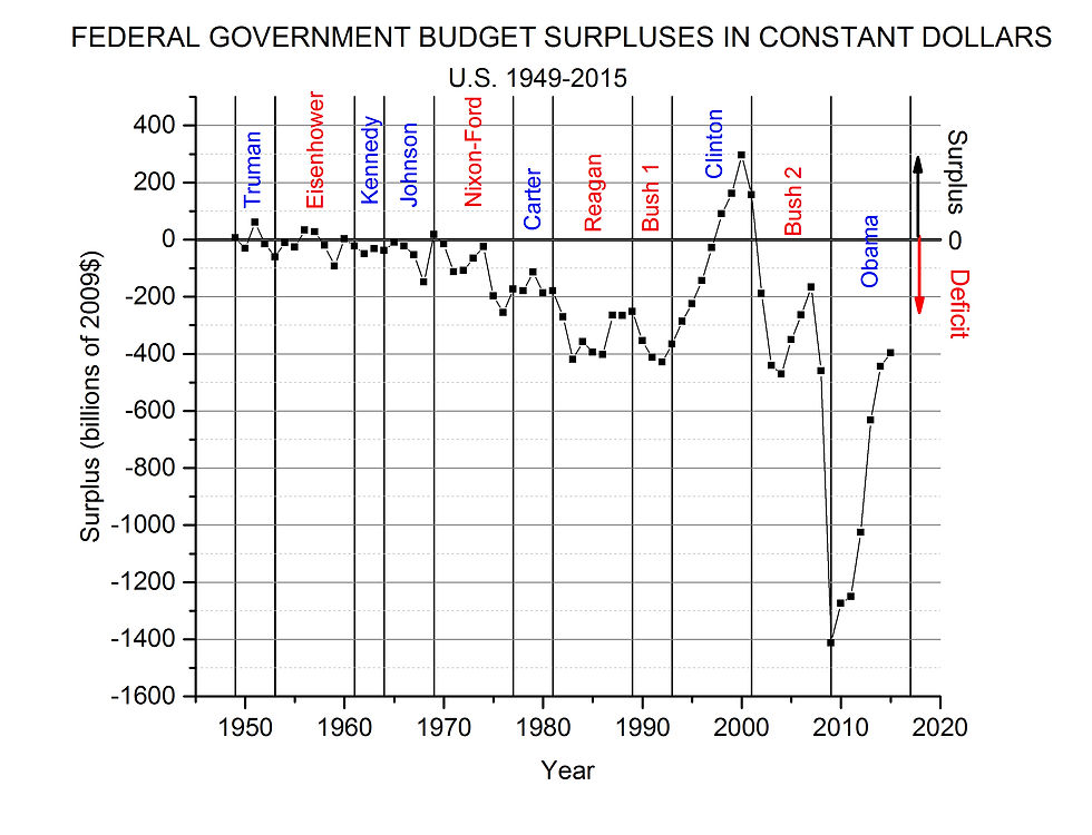
Figure 6

One of the most obvious features of these graphs is the few surpluses: two in the Truman administration, three in the Eisenhower, one in the first year of the Nixon, and three in the Clinton along with one in the first year of the G.W. Bush presidency. That amounts to ten years of budget surpluses out of 67, and three of those were very small. The other 57 years saw deficits. The Clinton administration saw a steady climb from fairly large deficits to four consecutive years of surpluses. The Bush administration is notable for taking the surpluses of the Clinton years and turning them into large deficits; two wars and a tax cut will do that every time. The Obama administration is characterized by a steady climb back from the horrible deficit of his first year, 2009. In all fairness, that deficit of Obama’s first year must be partly due to the fact that he has been the only president to inherit two wars and an economy in the worst free fall since the Great Depression. The climb back is impressive when one considers that 2015 had a deficit that was about the same percent of GDP as the best years of the whole Reagan – G.H.W. Bush era, 1981 through 1992.
The “Spending” Party
None of the data presented so far shows any clear choice between the political parties as far is spending is concerned. Table 1, which shows mean values and standard deviations, only emphasizes this point.
Table 1
MEANS AND STANDARD DEVIATIONS BY PARTY IN THE WHITE HOUSE, 1949 - 2015

There is no statistically significant difference between the Democratic and Republican means at the 5% level, as determined by the two sample t-test. That is, the null hypothesis (zero difference between the means) has more than a 5% probability. In all five of the measures, in fact, that probability is much more than 5%, sometimes more than 50%. We may conclude that, as far as the party of the president, neither is, or both are, the “spending” party.
Gary Waldman – May 2016
2019 Update
The OMB has changed Table 1.3 to 2012$, but the numbers as a percentage of GDP remain the same. In 2016, the budget deficit increased to 3.2% of GDP and has continued to increase during the first two years of the Trump administration (3.9% in 2018). Meanwhile outlays have remained right about 20% of GDP (2013-2018).
[1] Data from the Office of Management and Budget, www.whitehouse.gov/omb/historicals Table 1.3
[2] Population data from www.multpl.com/united-states-population/table


Comments